• Documentation
  • Ask a Question
  • Zeroplat.io
  • Documentation
  • Ask a Question
  • Zeroplat.io
  • Introduction
    • Welcome to Zeroplat
    • Video Intro
  • Get Started
    • Requirements
    • Installation
  • Management
    • Resources
    • SaaS
      • Multi-tenancy
      • Editions
    • Permissions
    • Organization Units
    • Language
      • Languages
      • Language Texts
    • Roles
    • User
      • Users
      • Invite Users
    • Audit Logs
  • Visual Builder
    • Overview
    • Resources
      • Menu & Navigation
      • Pages
      • Dashboards
      • Components
      • Generate Pages from Datasource
    • Design
      • JS Query
      • Transformer
      • Variable
    • Event Designer
      • Tasks
        • Execute query
        • Start workflow
        • Show page
        • Close Page
        • Set variable
        • Show notification
        • Set components props
      • Switch
        • If
        • Confirm box
        • Confirm popover
    • Data
    • Preview & Publish
    • Components
      • Common Properties
        • Layout
        • Style
        • Actions
        • Validations
        • Tooltip
      • Inputs
        • Button
        • Input
        • InputNumeric
        • ComboBox
        • MulticolumnCombobox
        • Checkbox
        • CheckboxGroup
        • Switch
        • RadioGroup
        • ToggleButtonGroup
        • LocalizedInput
        • Slider
      • Business
        • OrganizationUnitBrowser
        • RoleBrowser
        • UserBrowser
      • Data display
        • DataGrid
      • Editors
        • QuillEditor
      • Feedback
        • Alert
        • Progress
      • File
        • Dropzone
        • FileButton
        • FileInput
      • Layout
        • SplitLayout
      • Navigation
        • TabBar
      • Pickers
        • DatePicker
        • DateTimePicker
        • DateRangePicker
        • DateCalendar
        • TimePicker
        • IconPicker
      • Surfaces
        • Card
      • Charts
        • AreaChart
  • Backend
    • Overview
  • Integrations
    • Overview
    • Environments
    • Database
      • MS SQL
      • SQL Lite
      • My SQL
      • PostgreSQL
    • API
      • Rest API
      • SMTP
      • Google Sheets
      • Twillio SMS
    • Javascript
      • Variable
      • Transformer
      • JS Query
    • Zeroplat Hosted
      • Zeroplat E-mail
  • Workflow (BPM)
    • Overview
    • Building and managing workflows
    • Inbox
    • Outbox
  • Marketplace
    • Overview
    • Management

Pages

20 views 0

Written by Zeroplat
7 September 2025

Overview

A Page represents an actual working screen inside the application.
While Menus are used to organize navigation, Pages are where the user interface and functionality are built.
Pages can contain forms, tables, charts, dashboards, or any custom components that the user adds in the Visual Designer.

Page Properties

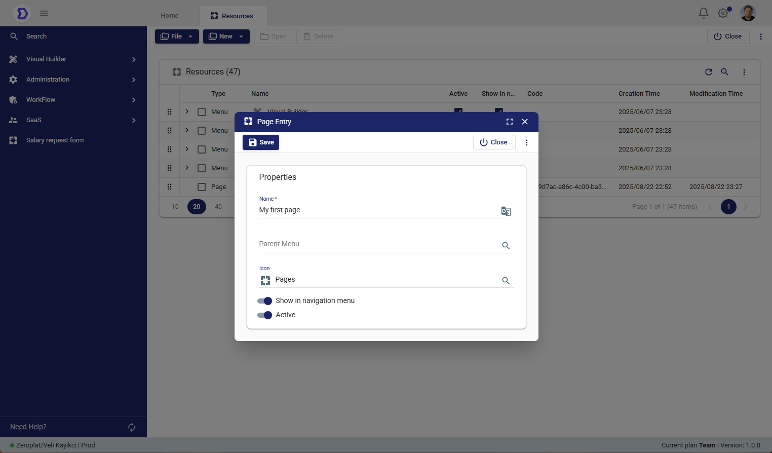
When creating a new page, the following properties are available:

  • Name*
    The display name of the page as it will appear in the navigation menu.
  • Parent Menu
    Allows you to assign the page to an existing menu.
    This ensures that the page will appear under the correct navigation group.
  • Icon
    Select an icon to visually represent the page in the navigation panel.
    Icons improve usability and help users quickly recognize the page.
  • Show in Navigation Menu
    Toggle this option to display the page in the navigation menu.
    If disabled, the page will not be visible but can still be accessed via direct links.
  • Active
    Defines whether the page is active.
    If set to inactive, the page will not be available for end-users.

Steps to Create a New Page

  1. Navigate to Visual Builder → Resources.
  2. Click the New button and select New Page.
  3. Fill in the required fields:
    • Enter a Name for the page.
    • (Optional) Assign a Parent Menu to organize it under navigation.
    • (Optional) Choose an Icon.
  4. Configure visibility and status:
    • Enable or disable Show in Navigation Menu.
    • Enable or disable Active.
  5. Click Save to create the page.
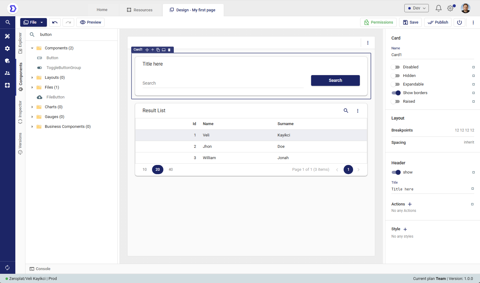
Designing a Page

After creating a new Page in the Resources section, the next step is to design its layout and functionality.
The Design feature in Zeroplat allows users to open the Visual Designer, where they can build user interfaces by dragging and dropping components, binding them to data sources, and configuring their properties.

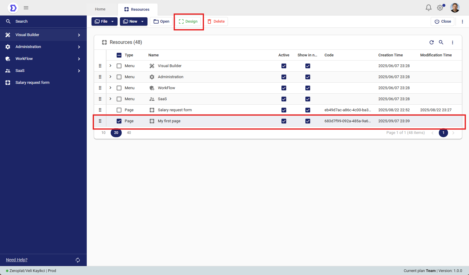
Accessing the Design Mode

  1. Navigate to Visual Builder → Resources.
  2. From the resource list, select the page you want to design (e.g., My first page).
  3. Click the Design button located in the top toolbar.

This will open the selected page in the Visual Designer environment.

What You Can Do in Design Mode

Once in Design Mode, users can:

  • Add Components
    Drag and drop elements such as tables, forms, charts, buttons, and inputs from the component library onto the canvas.
  • Organize Layouts
    Use containers, rows, and grids to create responsive designs.
  • Bind Data
    Connect components to data sources such as APIs or databases to display live data.
  • Configure Properties
    Adjust styling, behavior, and validation rules for each component.
  • Set Events & Actions
    Define interactions such as navigation, form submission, or workflow execution when users interact with components.

Usage Example

  • A “My first page” could be designed as an Employee List with:
    • A table component showing employee records from the database.
    • A search input for filtering employees.
    • A button to add a new employee that triggers a workflow.

Was this helpful?

Yes  No
Related Articles
  • DateCalendar
  • Progress
  • TimePicker
  • IconPicker
  • DateTimePicker
  • DateRangePicker

Didn't find your answer? Contact Us

Previously
Menu & Navigation
Up Next
Dashboards
Copyright 2025 Zeroplat.io. All Rights Reserved