
Overview
User Components are reusable building blocks in Zeroplat.
Unlike a standard page or dashboard, a User Component can be designed once and then reused across multiple locations, including:
- Other Pages
- Dashboards
- Even inside other User Components
This modular approach saves time, improves consistency, and ensures a scalable application structure.
User Component Properties
When creating a new User Component, the following properties are available:
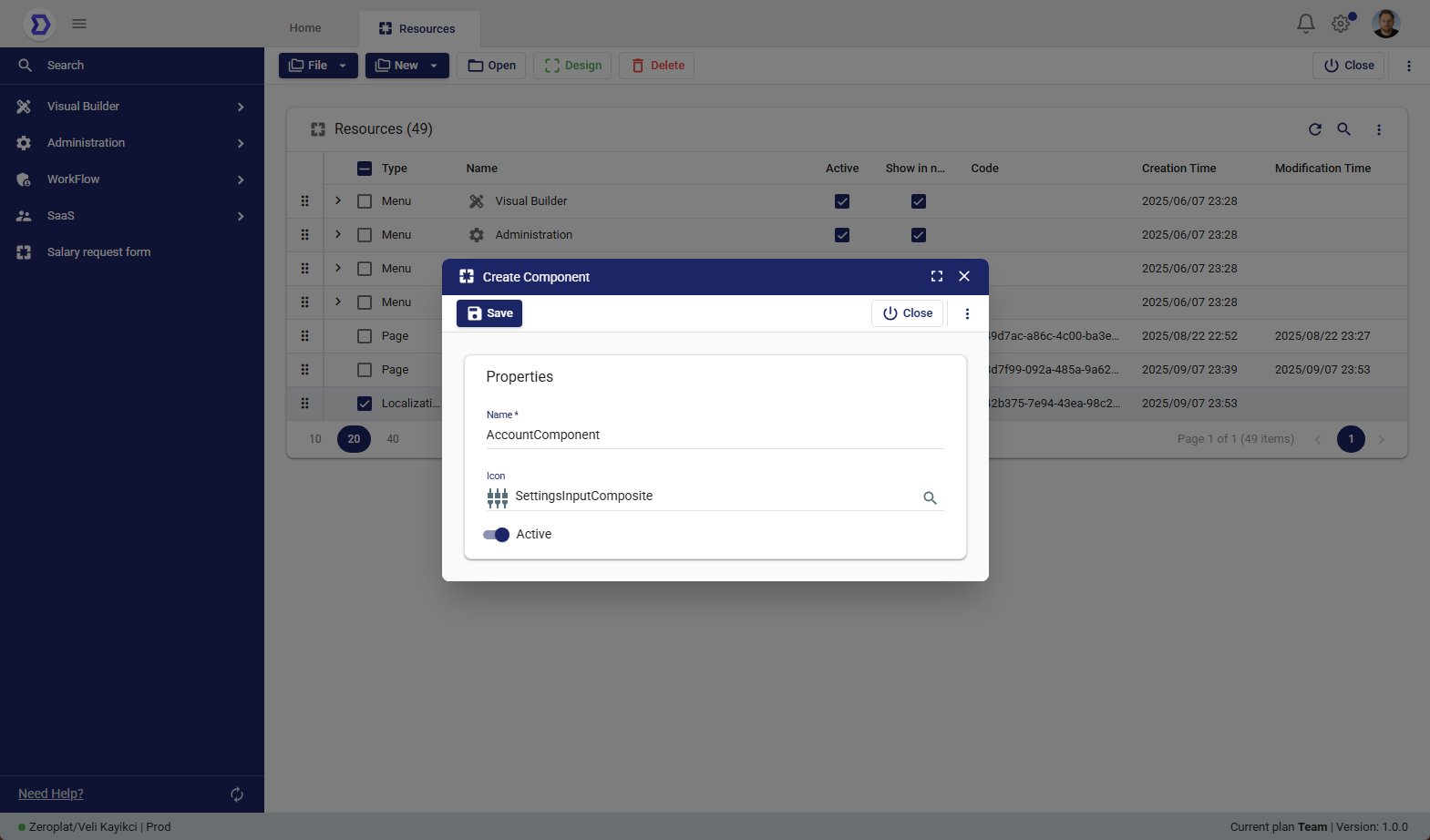
- Name*
The unique name of the component.
This name will be used to identify and reference the component in other resources. - Icon
An optional icon that represents the component visually in the resource list. - Active
Defines whether the component is enabled or disabled.
Disabled components remain in the system but cannot be used in other pages or dashboards.
Steps to Create a User Component
- Navigate to Visual Builder → Resources.
- Click New → New User Component.
- Fill in the required fields:
- Enter a Name for the component (e.g., AccountComponent).
- (Optional) Select an Icon.
- Set the Active status.
- Click Save to create the component.
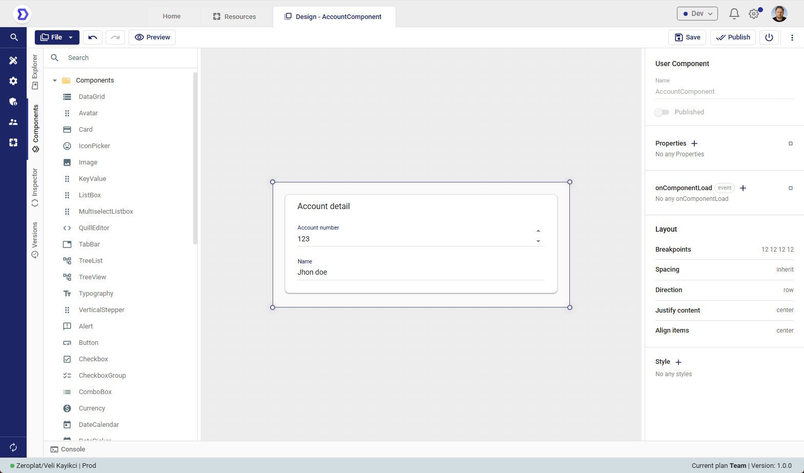
Designing a User Component
After creating a User Component, the next step is to design its layout and behavior.
Designing a component works the same way as designing a page: the Visual Designer opens, allowing you to add UI elements, configure properties, and bind data.
The main difference is that User Components are reusable and can later be embedded inside pages, dashboards, or even other components.
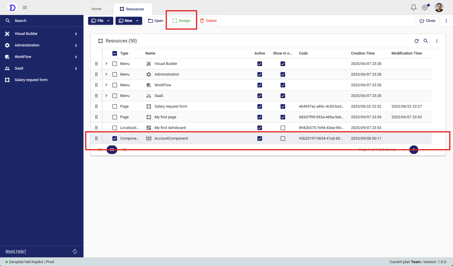
Accessing Design Mode for a Component
- Navigate to Visual Builder → Resources.
- From the list of resources, locate the component you want to design (e.g., AccountComponent).
- Select the component by checking the box next to its name.
- Click the Design button in the top toolbar.
This action will open the Visual Designer interface, where you can build the component’s structure.
What You Can Do in Component Design Mode
Inside the Visual Designer, you can:
- Add UI Elements
Insert controls such as input fields, buttons, tables, forms, and charts. - Organize Layouts
Use containers, rows, and grids to define how the component should look. - Set Properties
Configure attributes like labels, styles, validation, and visibility rules. - Bind Data
Connect fields to external data sources (APIs, databases) or pass parameters when used inside a page or dashboard. - Define Events & Actions
Set event handlers such as button clicks, navigation, or triggering workflows.
Publishing a User Component
After designing a User Component in the Visual Designer, it must be published before it can be reused inside pages, dashboards, or other components.
Publishing finalizes the design and makes the component available for use across the application.
Steps to Publish a Component
- Open the component in Design Mode.
- Add the necessary UI elements, configure properties, and set up events as required.
- Example: A component called AccountComponent may include account number and name fields.
- Once the design is complete, click the Publish button in the top-right corner.
- After publishing, the component becomes available in the system and can be inserted into other resources.
Important Note – Refresh Required
After publishing a new component, you must refresh the application to ensure it appears in the available resource list.
- Without refreshing, the component may not yet be visible in dropdowns or selection menus.
- Once refreshed, the published component will be ready for immediate use.
Using a User Component in a Page
Once a User Component has been designed and published, it can be reused inside any Page, Dashboard, or even another User Component.
This allows developers to build modular and reusable UI elements, ensuring consistency across the application.
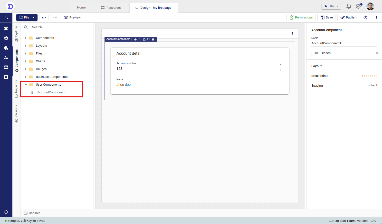
Steps to Add a User Component to a Page
- Navigate to Visual Builder → Resources.
- Open the page you want to edit by selecting it and clicking Design.
- In the left-hand panel, expand the User Components section.
- All published components will be listed here.
- Example: AccountComponent.
- Drag and drop the desired User Component onto the page canvas.
- Adjust layout, properties, and visibility settings from the Inspector Panel on the right side.
- Click Save or Publish to apply changes.
Behavior
- The inserted component behaves exactly as it was designed.
- Any updates to the User Component design will automatically be reflected wherever it is used, after republishing and refreshing.
Usage Example
- A User Component called AccountComponent (containing account details) can be:
- Placed inside a Page called My first page.
- Reused across multiple dashboards to ensure consistent account information display.
This reduces duplication and ensures that business logic and UI design remain centralized.