• Documentation
  • Ask a Question
  • Zeroplat.io
  • Documentation
  • Ask a Question
  • Zeroplat.io
  • Introduction
    • Welcome to Zeroplat
    • Video Intro
  • Get Started
    • Requirements
    • Installation
  • Management
    • Resources
    • SaaS
      • Multi-tenancy
      • Editions
    • Permissions
    • Organization Units
    • Language
      • Languages
      • Language Texts
    • Roles
    • User
      • Users
      • Invite Users
    • Audit Logs
  • Visual Builder
    • Overview
    • Resources
      • Menu & Navigation
      • Pages
      • Dashboards
      • Components
      • Generate Pages from Datasource
    • Design
      • JS Query
      • Transformer
      • Variable
    • Event Designer
      • Tasks
        • Execute query
        • Start workflow
        • Show page
        • Close Page
        • Set variable
        • Show notification
        • Set components props
      • Switch
        • If
        • Confirm box
        • Confirm popover
    • Data
    • Preview & Publish
    • Components
      • Common Properties
        • Layout
        • Style
        • Actions
        • Validations
        • Tooltip
      • Inputs
        • Button
        • Input
        • InputNumeric
        • ComboBox
        • MulticolumnCombobox
        • Checkbox
        • CheckboxGroup
        • Switch
        • RadioGroup
        • ToggleButtonGroup
        • LocalizedInput
        • Slider
      • Business
        • OrganizationUnitBrowser
        • RoleBrowser
        • UserBrowser
      • Data display
        • DataGrid
      • Editors
        • QuillEditor
      • Feedback
        • Alert
        • Progress
      • File
        • Dropzone
        • FileButton
        • FileInput
      • Layout
        • SplitLayout
      • Navigation
        • TabBar
      • Pickers
        • DatePicker
        • DateTimePicker
        • DateRangePicker
        • DateCalendar
        • TimePicker
        • IconPicker
      • Surfaces
        • Card
      • Charts
        • AreaChart
  • Backend
    • Overview
  • Integrations
    • Overview
    • Environments
    • Database
      • MS SQL
      • SQL Lite
      • My SQL
      • PostgreSQL
    • API
      • Rest API
      • SMTP
      • Google Sheets
      • Twillio SMS
    • Javascript
      • Variable
      • Transformer
      • JS Query
    • Zeroplat Hosted
      • Zeroplat E-mail
  • Workflow (BPM)
    • Overview
    • Building and managing workflows
    • Inbox
    • Outbox
  • Marketplace
    • Overview
    • Management

Confirm popover

5 views 0

Written by Zeroplat
17 September 2025

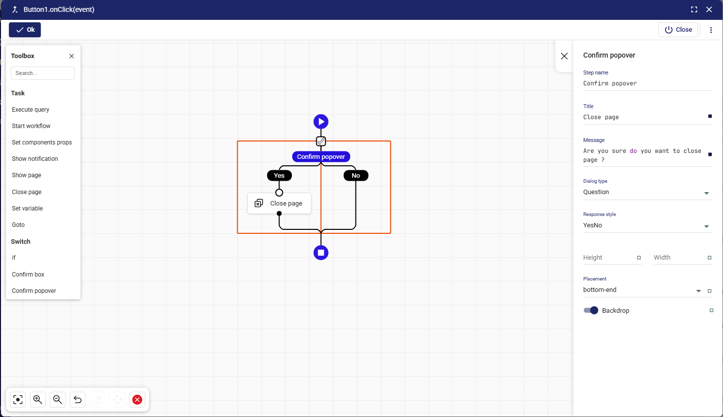
The Confirm popover task is a lightweight alternative to the Confirm box. Instead of opening a full dialog window, it displays a small popover confirmation directly in the UI. This is useful when you want to ask for confirmation without interrupting the user’s workflow.

Purpose

  • Get user confirmation in a less intrusive way.
  • Use for inline actions (e.g., deleting a row, confirming a small change).
  • Keep the user in context while still preventing accidental actions.

Anatomy

  1. Step name
    • Name of the task in the flow.
    • Example: Confirm popover.
  2. Title
    • Title displayed inside the popover.
    • Example: Close page.
  3. Message
    • The confirmation text shown to the user.
    • Example: Are you sure do you want to close page ?.
  4. Dialog type
    • Defines the type/style of the popover.
    • Options: Question, Warning, Info, Error.
  5. Response style
    • Defines the response buttons.
    • Options:
      • YesNo
      • YesCancel
      • YesNoCancel
      • OkCancel
      • Ok
  6. Height / Width
    • Customize the dimensions of the popover.
    • Useful for longer messages or customized layouts.
  7. Placement
    • Defines where the popover appears relative to the anchor.
    • Example values: bottom-end, top-start, right, etc.
  8. Backdrop
    • Option to enable/disable a backdrop behind the popover.
    • When enabled, the rest of the UI is dimmed.

How It Works

  1. When the Confirm popover is triggered, it shows up next to the related element.
  2. The user selects an option (Yes / No, Ok / Cancel, etc.).
  3. Based on the response, the workflow continues down the correct branch.
  4. If the user dismisses it, the default behavior is treated as No/Cancel.

Example 1: Row Delete Confirmation

  • Title: Delete record
  • Message: Do you want to delete this item?
  • Dialog type: Warning
  • Response style: YesNo
  • Placement: bottom-end

Yes branch → Execute query deleteRecord
No branch → Show notification → “Delete cancelled.”

Example 2: Inline Page Close

  • Title: Close page
  • Message: Are you sure you want to close this page?
  • Dialog type: Question
  • Response style: OkCancel

Ok branch → Close page
Cancel branch → Do nothing

Best Practices

  • Use popovers for lightweight actions → Ideal when you want confirmation without leaving the current UI context.
  • Avoid for critical destructive actions → For high-risk operations (e.g., permanent delete), prefer a Confirm box with stronger visual emphasis.
  • Placement matters → Choose a placement that doesn’t obstruct important UI elements.
  • Keep messages short → Popovers should stay minimal; long instructions belong in dialogs.

👉 In summary: The Confirm popover task is a non-intrusive confirmation method in Zeroplat workflows. It gives users the ability to confirm or cancel actions directly within the current interface, providing a smoother experience for inline interactions.

Was this helpful?

Yes  No
Related Articles
  • DateCalendar
  • Progress
  • TimePicker
  • IconPicker
  • DateTimePicker
  • DateRangePicker

Didn't find your answer? Contact Us

Previously
Confirm box
Up Next
Data
Copyright 2025 Zeroplat.io. All Rights Reserved