
The CheckboxGroup component allows users to select multiple values from a list of options. It can be configured manually or dynamically mapped from a data source.
1. Basic Properties
- Name: The unique identifier of the group (e.g.,
CheckboxGroup1). - Label: The text displayed next to the checkbox group.
States
- Disabled: Prevents interaction with the group.
- Hidden: Hides the group from the UI while keeping it available in logic.
- Required: Ensures at least one checkbox is selected.
2. Mode
The Mode defines how the items in the group are created:
- Manual → Add items manually inside the editor.
- Example: Item 1, Item 2
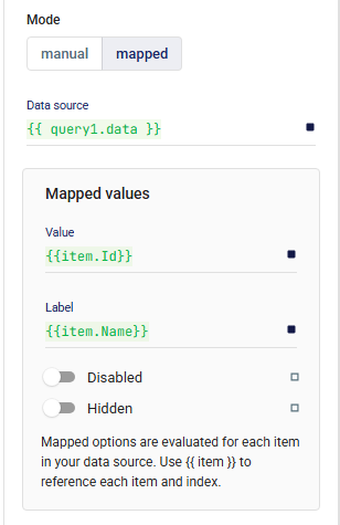
- Mapped → Dynamically populate items from a data source (similar to Retool).
- Data Source: A query or variable returning a list of objects (e.g.,
{{ query1.data }}). - Mapped Values:
- Value: The underlying value (e.g.,
{{ item.Id }}). - Label: The display label (e.g.,
{{ item.Name }}). - Disabled / Hidden: Optionally disable or hide items based on conditions.
- Value: The underlying value (e.g.,
- Data Source: A query or variable returning a list of objects (e.g.,
Default Checked Values
You can specify which items are selected initially (e.g., {{ ["item1"] }}).
3. Layout
Defines how the group behaves in responsive design and spacing relative to other components.
📘 See Common Properties → Layout.
4. Events
- onChange: Triggered whenever a checkbox inside the group is selected or deselected.
5. Validations
Validation rules can be added to enforce conditions such as requiring at least one selected option.
📘 See Common Properties → Validations.
6. Direction
Defines the layout direction of the checkboxes:
- Horizontal → Items displayed side by side.
- Vertical → Items stacked in a column.
7. Style
Custom styles can be applied for further design adjustments.
📘 See Common Properties → Style.
✅ With the CheckboxGroup component, you can build both static and dynamic multi-select inputs. Using Mapped Mode, it easily connects to live data sources and updates automatically when your data changes.