
The ToggleButtonGroup component allows users to select one or multiple options using toggle-style buttons. It supports both manual and data-mapped configurations, making it useful for dynamic UIs where options may come from external sources.
1. Basic Properties
- Name: The unique identifier of the toggle button group (e.g.,
ToggleButtonGroup1). - Toggle Buttons: Items that define the available options in the group.
- Selection Mode:
- Single → Only one button can be active at a time.
- Multiple → Multiple buttons can be selected simultaneously.
- Default Selected Value: Defines which button(s) are selected initially.
States
- Disabled: Makes the entire group non-interactive.
- Hidden: Hides the component from the UI but keeps it in logic.
- Full Width: Expands the group to fill its container’s width.
2. Mode
The Mode defines how the toggle buttons are created:
- Manual → Add buttons manually in the editor.
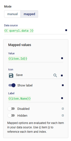
- Mapped → Dynamically generate buttons from a data source.
- Data Source: A query or variable providing a list (e.g.,
{{ query1.data }}). - Mapped Values:
- Value → The underlying stored value (e.g.,
{{ item.Id }}). - Label → The display text (e.g.,
{{ item.Name }}). - Icon → Optional icon for each button.
- Show Label → Toggle whether the label is shown alongside the icon.
- Disabled / Hidden → Conditions to disable or hide specific buttons.
- Value → The underlying stored value (e.g.,
- Data Source: A query or variable providing a list (e.g.,
3. Layout
Controls how the group is displayed across responsive breakpoints and its spacing relative to other components.
📘 For details, see Common Properties → Layout.
4. Events
- onChange: Triggered whenever the selected value(s) change.
5. Size, Color & Orientation
- Size: Choose between
small,medium, andlarge. - Color: Define the color scheme (e.g.,
primary). - Orientation:
- Horizontal → Buttons arranged side by side.
- Vertical → Buttons arranged in a column.
6. Style
Custom styles can be applied for further UI customization.
📘 For details, see Common Properties → Style.
✅ The ToggleButtonGroup component is versatile for building interactive controls. With Selection Mode, it can act like a radio group (single selection) or a checkbox group (multi-selection). Combined with Mapped Mode, it becomes dynamic and automatically adapts to live data sources.