
The IconPicker component allows users to choose an icon from a wide collection. It provides an integrated dialog with search, category filters, and preview, making it easy to find and select the right icon for UI elements like buttons, menus, dashboards, and forms.
1. Basic Properties
- Name → Unique identifier for the component (e.g.,
IconPicker1). - Label → Text displayed above the picker field (e.g.,
Icon). - Default icon → Pre-selected icon when the component loads (e.g.,
People). - Placeholder → Text shown when no icon is selected.
2. Icon Picker Dialog
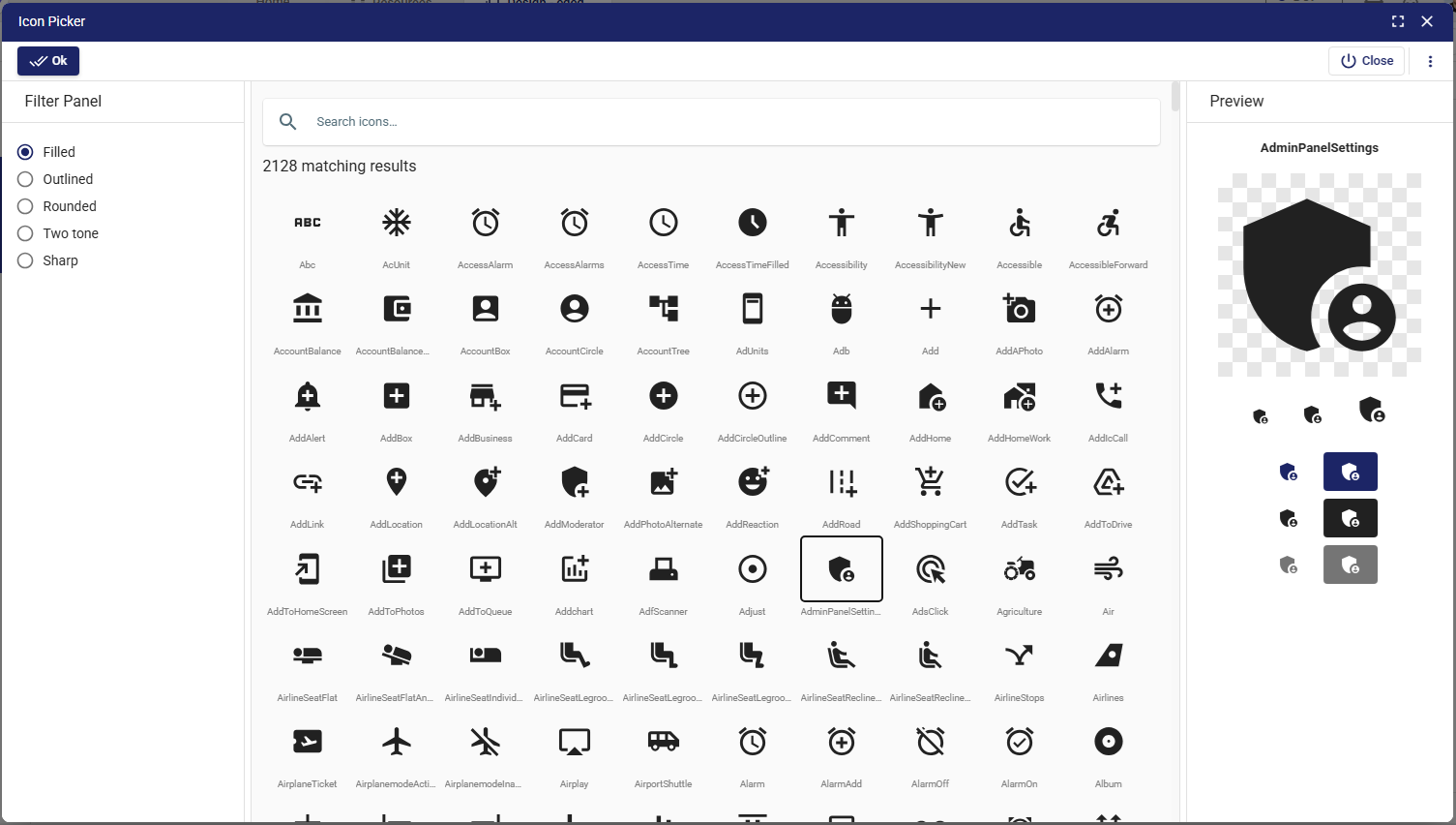
When the search icon (🔍) is clicked, the Icon Picker dialog opens. It includes:
- Search bar → Allows searching by icon name (e.g.,
alarm,add,user). - Filter panel → Lets users filter icons by style:
- Filled
- Outlined
- Rounded
- Two-tone
- Sharp
- Result grid → Displays a large list of matching icons with their names.
- Preview panel → Shows the selected icon in different sizes and states for visual confirmation.
- Ok / Close buttons → Confirm or cancel the selection.
3. Events
- onChange → Triggered whenever a new icon is selected.
- Example usage: update a menu item’s icon or dynamically change a button’s symbol.
4. Validations
- Required → Ensures that the user must select an icon.
- Can also be extended with custom validation rules (e.g., specific icons allowed only in certain contexts).
📘 See Common Properties → Validations.
5. States
- Read only → Displays the field but prevents changes.
- Disabled → Grays out the field and disables selection.
- Hidden → Hides the field but keeps it usable in logic.
- Auto focus → Automatically focuses the field on page load.
- Required → Forces the user to select an icon before proceeding.
6. Color
The color of the selected icon can be set:
- primary
- secondary
- (or custom colors via styles).
7. Layout
Responsive grid support for placing the component inside forms or dashboards.
📘 See Common Properties → Layout.
8. Style
Custom styling can be applied for:
- Icon size
- Spacing
- Margins and paddings
- Alignment
📘 See Common Properties → Style.
9. Business Use Cases
- Custom dashboards → Users select icons for their own widgets.
- Dynamic menus → Admins assign icons to navigation items.
- Forms and actions → Add visual cues (e.g., download, upload, warning).
- Brand personalization → Choose icons matching company identity.
✅ The IconPicker component provides a rich user interface for selecting icons, with search, filtering, and preview functionality. It simplifies UI customization and ensures consistent icon usage across applications.