
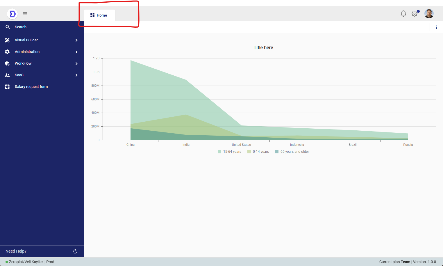
Overview
A Dashboard is a special type of page used to display multiple data-driven widgets such as charts, tables, and key performance indicators (KPIs).
Dashboards allow users to monitor application data in real time, providing a centralized view for analytics and decision-making.
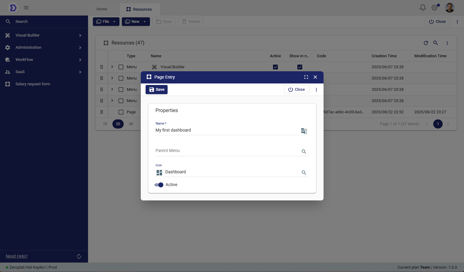
Dashboard Properties
When creating a new dashboard, the following properties are available:
- Name*
The display name of the dashboard as it will appear in the navigation menu. - Parent Menu
Assign the dashboard to an existing menu.
This allows the dashboard to be grouped with other related resources in the navigation panel. - Icon
Choose an icon to represent the dashboard visually in the navigation panel. - Active
Determines whether the dashboard is active or inactive.
Inactive dashboards remain in the system but are not accessible by end-users.
Steps to Create a New Dashboard
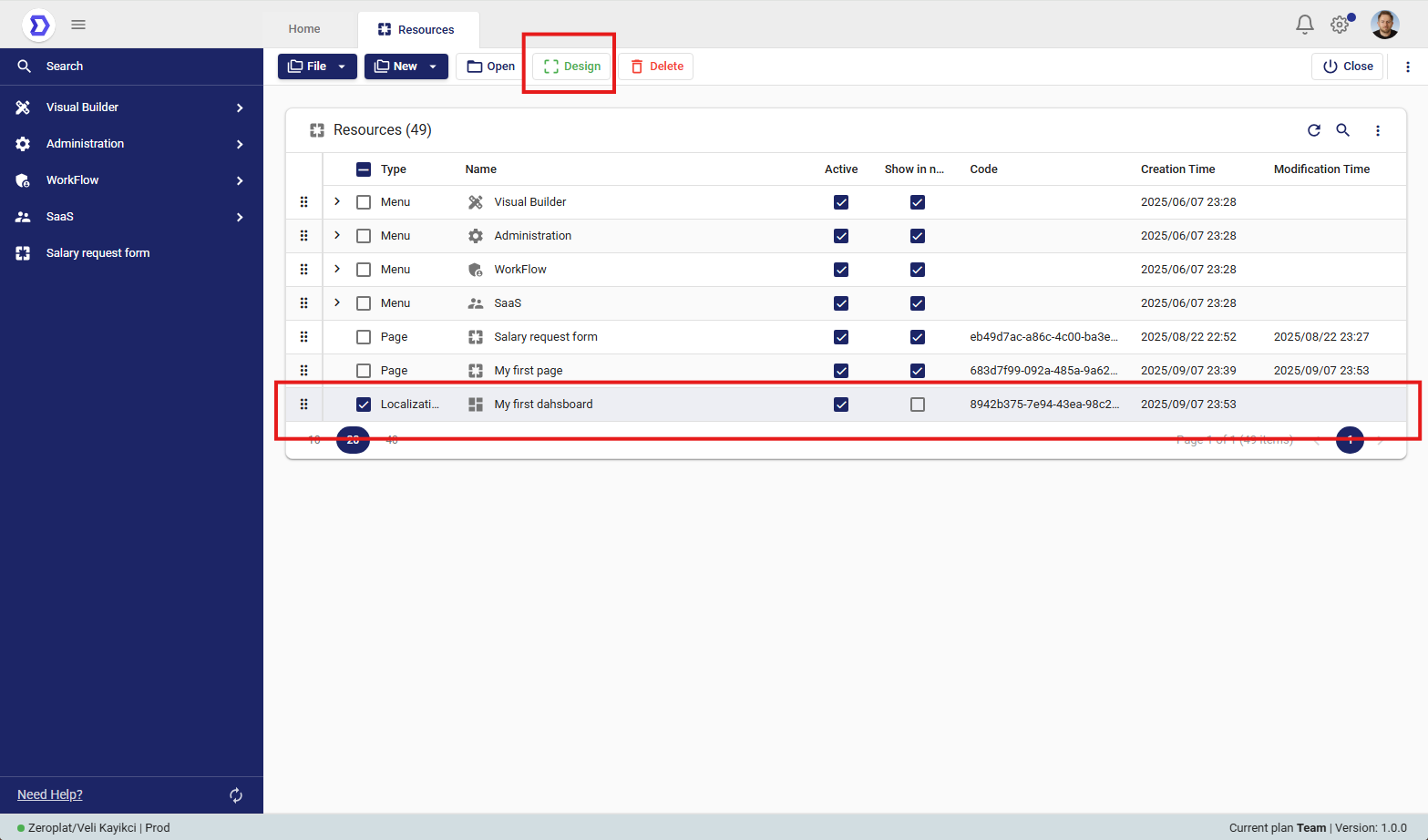
- Navigate to Visual Builder → Resources.
- Click the New button and select New Dashboard.
- Fill in the required fields:
- Enter a Name for the dashboard.
- (Optional) Assign a Parent Menu if you want the dashboard to appear under a specific menu.
- (Optional) Choose an Icon.
- Configure the Active status.
- Click Save to create the dashboard.
Usage Example
- A dashboard named Sales Overview may contain revenue charts, sales performance KPIs, and regional breakdown tables.
- Another dashboard called System Monitoring might display server health, uptime statistics, and API usage metrics.
This helps users gain quick insights and take informed actions without navigating across multiple pages.
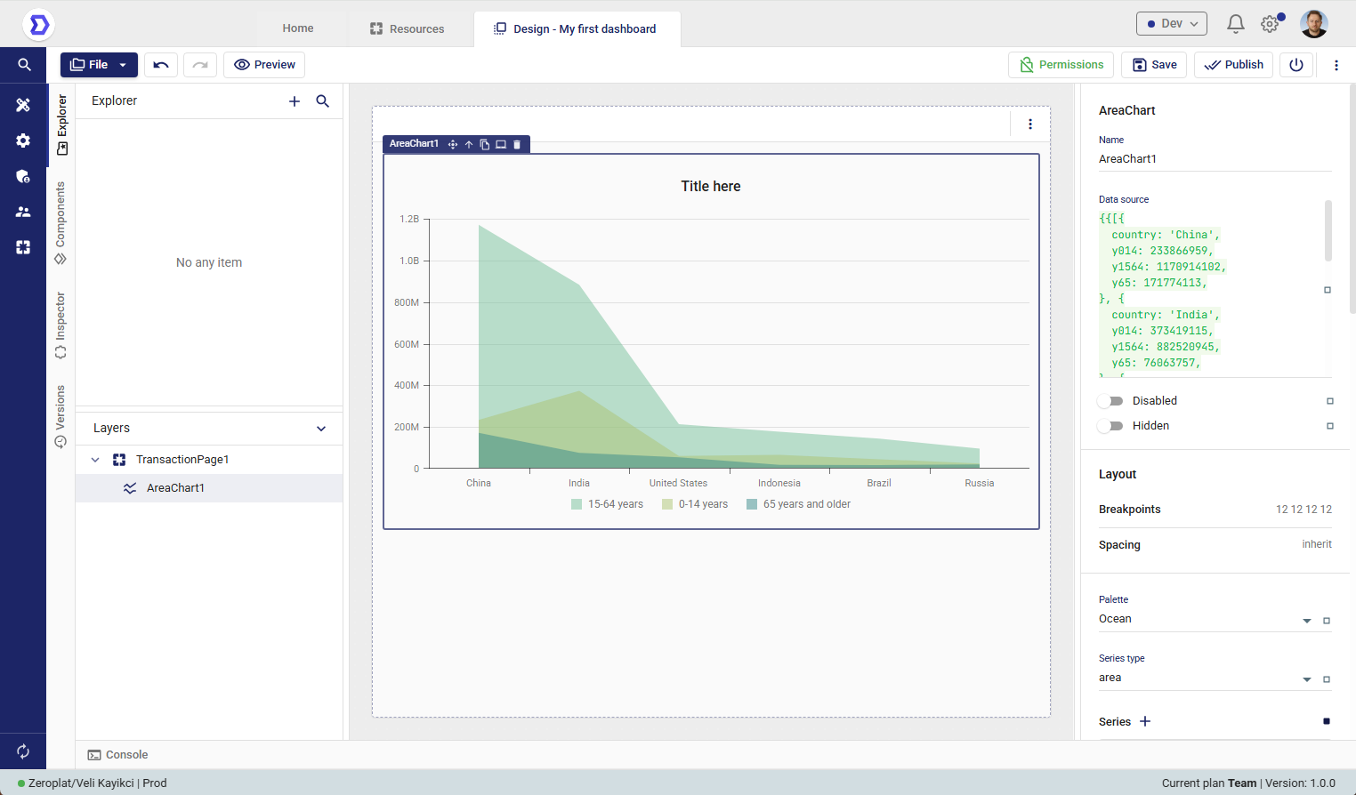
Designing a Dashboard
After creating a new Dashboard in the Resources section, the next step is to design its layout and functionality.
The Design feature in Zeroplat allows users to open the Visual Designer, where they can build user interfaces by dragging and dropping components, binding them to data sources, and configuring their properties.
Accessing the Design Mode
- Navigate to Visual Builder → Resources.
- From the resource list, select the page you want to design (e.g., My first page).
- Click the Design button located in the top toolbar.
This will open the selected page in the Visual Designer environment.
Using a Custom Dahsboard
Once a new Dashboard has been created, users can personalize their home screen by assigning it as their Custom Dashboard.
This allows each user to decide what they want to see when they log in, ensuring quick access to the most relevant data and widgets.
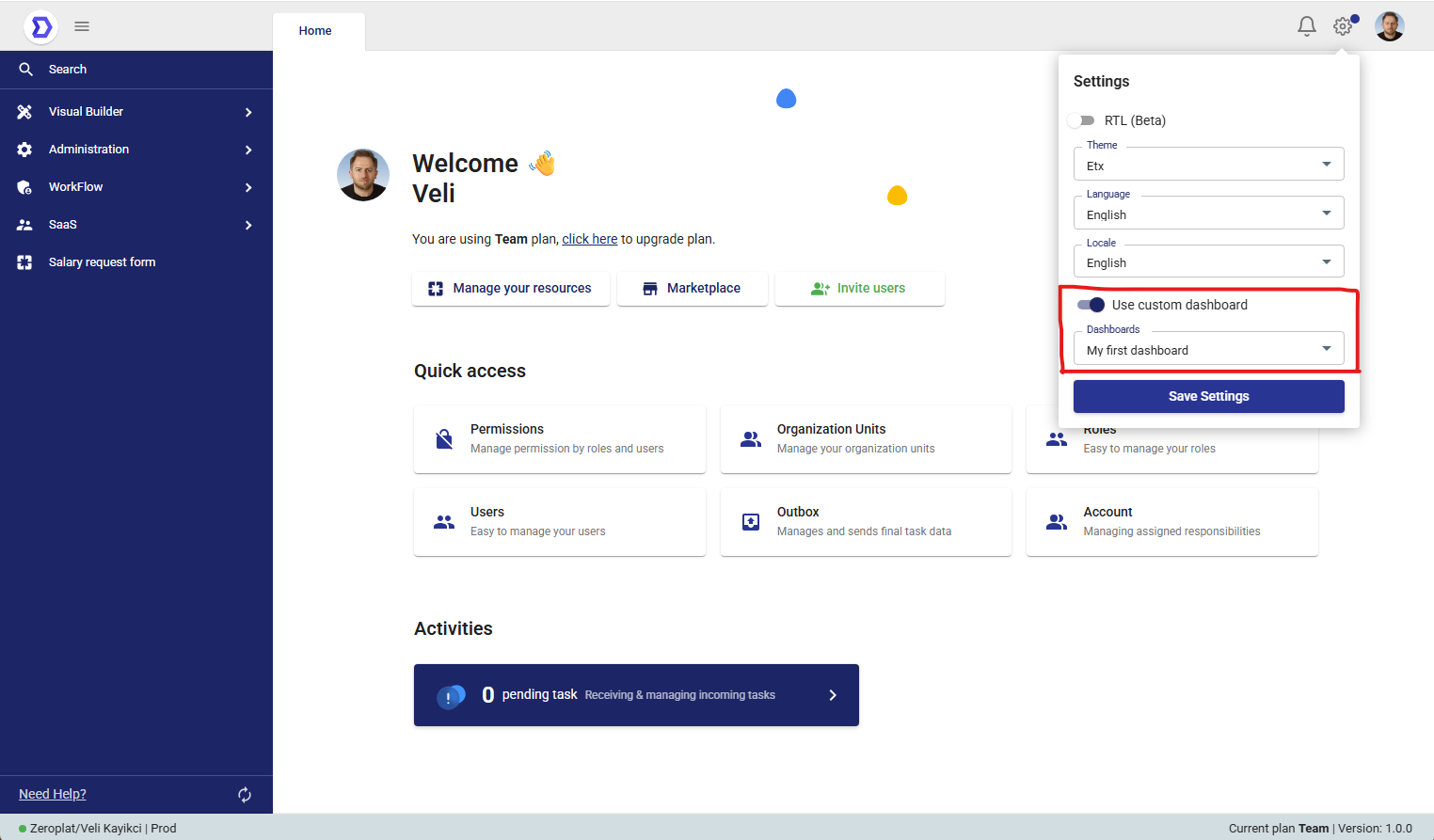
Enabling a Custom Dashboard
- Open the Settings panel from the right-hand side.
- Toggle the switch Use custom dashboard.
- In the Dashboards dropdown, select one of the dashboards you created (e.g., My first dashboard).
- Click Save Settings to apply the changes.
Behavior
- When Use custom dashboard is enabled, the selected dashboard will replace the default home view.
- If disabled, the system will show the standard home page with quick access options and activities.
- Users can change this setting at any time to switch between different dashboards.