• Documentation
  • Ask a Question
  • Zeroplat.io
  • Documentation
  • Ask a Question
  • Zeroplat.io
  • Introduction
    • Welcome to Zeroplat
    • Video Intro
  • Get Started
    • Requirements
    • Installation
  • Management
    • Resources
    • SaaS
      • Multi-tenancy
      • Editions
    • Permissions
    • Organization Units
    • Language
      • Languages
      • Language Texts
    • Roles
    • User
      • Users
      • Invite Users
    • Audit Logs
  • Visual Builder
    • Overview
    • Resources
      • Menu & Navigation
      • Pages
      • Dashboards
      • Components
      • Generate Pages from Datasource
    • Design
      • JS Query
      • Transformer
      • Variable
    • Event Designer
      • Tasks
        • Execute query
        • Start workflow
        • Show page
        • Close Page
        • Set variable
        • Show notification
        • Set components props
      • Switch
        • If
        • Confirm box
        • Confirm popover
    • Data
    • Preview & Publish
    • Components
      • Common Properties
        • Layout
        • Style
        • Actions
        • Validations
        • Tooltip
      • Inputs
        • Button
        • Input
        • InputNumeric
        • ComboBox
        • MulticolumnCombobox
        • Checkbox
        • CheckboxGroup
        • Switch
        • RadioGroup
        • ToggleButtonGroup
        • LocalizedInput
        • Slider
      • Business
        • OrganizationUnitBrowser
        • RoleBrowser
        • UserBrowser
      • Data display
        • DataGrid
      • Editors
        • QuillEditor
      • Feedback
        • Alert
        • Progress
      • File
        • Dropzone
        • FileButton
        • FileInput
      • Layout
        • SplitLayout
      • Navigation
        • TabBar
      • Pickers
        • DatePicker
        • DateTimePicker
        • DateRangePicker
        • DateCalendar
        • TimePicker
        • IconPicker
      • Surfaces
        • Card
      • Charts
        • AreaChart
  • Backend
    • Overview
  • Integrations
    • Overview
    • Environments
    • Database
      • MS SQL
      • SQL Lite
      • My SQL
      • PostgreSQL
    • API
      • Rest API
      • SMTP
      • Google Sheets
      • Twillio SMS
    • Javascript
      • Variable
      • Transformer
      • JS Query
    • Zeroplat Hosted
      • Zeroplat E-mail
  • Workflow (BPM)
    • Overview
    • Building and managing workflows
    • Inbox
    • Outbox
  • Marketplace
    • Overview
    • Management

ComboBox

4 views 0

Written by Zeroplat
21 September 2025

The ComboBox component combines an input field with a dropdown list, allowing users to either type a value or select from predefined options. It supports both static and dynamic data sources.

1. Basic Properties

  • Name: The unique identifier of the combo box (e.g., ComboBox1).
  • Items: Options available in the dropdown list (when in manual mode).
  • Default Value: The initially selected value (e.g., item1).
  • Label: The text displayed above the combo box.
  • Placeholder: A hint shown in the input when no value is selected.

States

  • Disabled: Makes the combo box non-interactive.
  • Hidden: Hides the combo box from the UI while keeping it available in logic.
  • Read Only: Displays the value but does not allow changes.
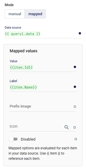
2. Mode

The Mode defines how the dropdown options are created:

  • Manual → Add items manually in the editor (e.g., Item 1, Item 2).
  • Mapped → Dynamically populate items from a data source.
    • Data Source: A query or variable providing a list (e.g., {{ query1.data }}).
    • Mapped Values:
      • Value → The stored value for the option (e.g., {{ item.Id }}).
      • Label → The displayed text (e.g., {{ item.Name }}).
      • Prefix Image / Icon → Optional visual enhancements for each item.
      • Disabled → Disable specific items conditionally.

3. Layout

Defines how the combo box is displayed across responsive breakpoints and how it aligns with other components.

📘 See Common Properties → Layout.

4. Events

  • onChange: Triggered when the selected value changes.

5. Validations

Validation rules ensure that the selected or entered value matches required conditions.

📘 See Common Properties → Validations.

6. Advanced Options

  • Filter Predicate: Custom filtering logic for search functionality.
  • Auto Focus: Automatically focuses the field on load.
  • Auto Complete: Enables typeahead suggestions.
  • Localized: Adjusts behavior for localization.
  • Auto Highlight: Highlights matching items as the user types.
  • Auto Select: Automatically selects the first matching option.
  • Close Text / Clear Text: Customize button labels.
  • Disable Clearable: Prevents the user from clearing the selection.
  • Disable Close on Select: Keeps the dropdown open after selection.
  • Loading: Shows a loading state when fetching data.
  • No Options Text: Custom message shown when no results are found.

7. Style

Custom styles can be applied to further customize appearance and behavior.

📘 See Common Properties → Style.

✅ The ComboBox is highly flexible, supporting both static options and dynamic data from queries. It is ideal for searchable dropdowns, autocompletion, and selection from large datasets.

Was this helpful?

Yes  No
Related Articles
  • DateCalendar
  • Progress
  • TimePicker
  • IconPicker
  • DateTimePicker
  • DateRangePicker

Didn't find your answer? Contact Us

Previously
InputNumeric
Up Next
MulticolumnCombobox
Copyright 2025 Zeroplat.io. All Rights Reserved