• Documentation
  • Ask a Question
  • Zeroplat.io
  • Documentation
  • Ask a Question
  • Zeroplat.io
  • Introduction
    • Welcome to Zeroplat
    • Video Intro
  • Get Started
    • Requirements
    • Installation
  • Management
    • Resources
    • SaaS
      • Multi-tenancy
      • Editions
    • Permissions
    • Organization Units
    • Language
      • Languages
      • Language Texts
    • Roles
    • User
      • Users
      • Invite Users
    • Audit Logs
  • Visual Builder
    • Overview
    • Resources
      • Menu & Navigation
      • Pages
      • Dashboards
      • Components
      • Generate Pages from Datasource
    • Design
      • JS Query
      • Transformer
      • Variable
    • Event Designer
      • Tasks
        • Execute query
        • Start workflow
        • Show page
        • Close Page
        • Set variable
        • Show notification
        • Set components props
      • Switch
        • If
        • Confirm box
        • Confirm popover
    • Data
    • Preview & Publish
    • Components
      • Common Properties
        • Layout
        • Style
        • Actions
        • Validations
        • Tooltip
      • Inputs
        • Button
        • Input
        • InputNumeric
        • ComboBox
        • MulticolumnCombobox
        • Checkbox
        • CheckboxGroup
        • Switch
        • RadioGroup
        • ToggleButtonGroup
        • LocalizedInput
        • Slider
      • Business
        • OrganizationUnitBrowser
        • RoleBrowser
        • UserBrowser
      • Data display
        • DataGrid
      • Editors
        • QuillEditor
      • Feedback
        • Alert
        • Progress
      • File
        • Dropzone
        • FileButton
        • FileInput
      • Layout
        • SplitLayout
      • Navigation
        • TabBar
      • Pickers
        • DatePicker
        • DateTimePicker
        • DateRangePicker
        • DateCalendar
        • TimePicker
        • IconPicker
      • Surfaces
        • Card
      • Charts
        • AreaChart
  • Backend
    • Overview
  • Integrations
    • Overview
    • Environments
    • Database
      • MS SQL
      • SQL Lite
      • My SQL
      • PostgreSQL
    • API
      • Rest API
      • SMTP
      • Google Sheets
      • Twillio SMS
    • Javascript
      • Variable
      • Transformer
      • JS Query
    • Zeroplat Hosted
      • Zeroplat E-mail
  • Workflow (BPM)
    • Overview
    • Building and managing workflows
    • Inbox
    • Outbox
  • Marketplace
    • Overview
    • Management

RadioGroup

2 views 0

Written by Zeroplat
20 September 2025

The RadioGroup component allows users to select a single option from a list of predefined values. It can be configured manually or dynamically mapped from a data source.

1. Basic Properties

  • Name: The unique identifier of the radio group (e.g., RadioGroup1).
  • Label: The text displayed next to the radio group.
  • Default Value: Defines which option is selected by default (e.g., "item1").

States

  • Disabled: Prevents interaction with the radio group.
  • Hidden: Hides the component from the UI while keeping it available in logic.
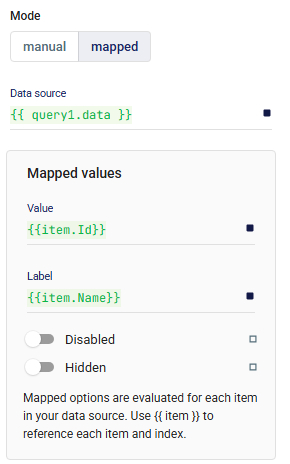
2. Mode

The Mode determines how the radio options are generated:

  • Manual → Add items manually in the editor.
    • Example: Item 1, Item 2
  • Mapped → Dynamically populate options from a data source.
    • Data Source: A query or variable returning a list of objects (e.g., {{ query1.data }}).
    • Mapped Values:
      • Value → The actual value stored when an item is selected (e.g., {{ item.Id }}).
      • Label → The display text for the option (e.g., {{ item.Name }}).
      • Disabled / Hidden → Optional conditions to disable or hide specific items.

3. Layout

Defines how the radio group behaves across responsive screen sizes and spacing relative to other components.

📘 See Common Properties → Layout.

4. Events

  • onChange: Triggered whenever the selected value changes.

5. Validations

Validation rules can enforce requirements, such as making the selection mandatory.

📘 See Common Properties → Validations.

6. Direction

Determines how the radio buttons are displayed:

  • Horizontal → Options side by side.
  • Vertical → Options stacked in a column.

7. Style

Custom styles can be applied to adjust appearance and alignment.

📘 See Common Properties → Style.

✅ With RadioGroup, you can create both static and dynamic single-choice inputs. Using Mapped Mode, the options can be directly connected to data sources, keeping the UI synchronized with live data.

Was this helpful?

Yes  No
Related Articles
  • DateCalendar
  • Progress
  • TimePicker
  • IconPicker
  • DateTimePicker
  • DateRangePicker

Didn't find your answer? Contact Us

Previously
Switch
Up Next
ToggleButtonGroup
Copyright 2025 Zeroplat.io. All Rights Reserved