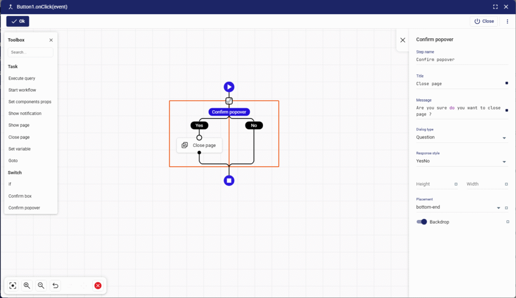
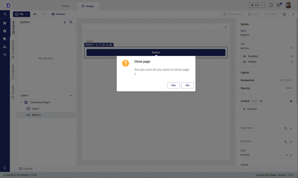
The Confirm popover task is a lightweight alternative to the Confirm box. Instead of opening a full dialog window, it displays a small popover confirmation directly in the UI. This is useful when you want to ask for confirmation without interrupting the user’s workflow.


Purpose
- Get user confirmation in a less intrusive way.
- Use for inline actions (e.g., deleting a row, confirming a small change).
- Keep the user in context while still preventing accidental actions.
Anatomy
- Step name
- Name of the task in the flow.
- Example:
Confirm popover.
- Title
- Title displayed inside the popover.
- Example:
Close page.
- Message
- The confirmation text shown to the user.
- Example:
Are you sure do you want to close page ?.
- Dialog type
- Defines the type/style of the popover.
- Options:
Question,Warning,Info,Error.
- Response style
- Defines the response buttons.
- Options:
- YesNo
- YesCancel
- YesNoCancel
- OkCancel
- Ok
- Height / Width
- Customize the dimensions of the popover.
- Useful for longer messages or customized layouts.
- Placement
- Defines where the popover appears relative to the anchor.
- Example values:
bottom-end,top-start,right, etc.
- Backdrop
- Option to enable/disable a backdrop behind the popover.
- When enabled, the rest of the UI is dimmed.
How It Works
- When the Confirm popover is triggered, it shows up next to the related element.
- The user selects an option (Yes / No, Ok / Cancel, etc.).
- Based on the response, the workflow continues down the correct branch.
- If the user dismisses it, the default behavior is treated as No/Cancel.
Example 1: Row Delete Confirmation
- Title:
Delete record - Message:
Do you want to delete this item? - Dialog type:
Warning - Response style:
YesNo - Placement:
bottom-end
Yes branch → Execute query deleteRecord
No branch → Show notification → “Delete cancelled.”
Example 2: Inline Page Close
- Title:
Close page - Message:
Are you sure you want to close this page? - Dialog type:
Question - Response style:
OkCancel
Ok branch → Close page
Cancel branch → Do nothing
Best Practices
- Use popovers for lightweight actions → Ideal when you want confirmation without leaving the current UI context.
- Avoid for critical destructive actions → For high-risk operations (e.g., permanent delete), prefer a Confirm box with stronger visual emphasis.
- Placement matters → Choose a placement that doesn’t obstruct important UI elements.
- Keep messages short → Popovers should stay minimal; long instructions belong in dialogs.
👉 In summary: The Confirm popover task is a non-intrusive confirmation method in Zeroplat workflows. It gives users the ability to confirm or cancel actions directly within the current interface, providing a smoother experience for inline interactions.